Monochromatic Color Schemes
Have you ever see a room styled around a single color and wondered what that design was called? They’re called monochromatic color schemes.
A monochromatic color scheme, or a room designed around a single main color, doesn’t actually have to use just one color. There can actually be lots of colors used in this type of design along with a variety of materials and textures. The only real requirement is that all the room’s colors should be related, or very close too, the main color. Monochromatic color schemes can give a room a modern, refined look with lots of energy and sophistication. Focusing on a single main color with a range of related shades and tints helps a space feel cohesive and harmonious. Especially when the design extends beyond just paint colors and into other things like furnishings and décor.
Picking a monochromatic color palette means committing to a single main color, but you can still use a wide range of accent colors throughout the room. Your also free to choose all sorts of materials, textures, patterns and other design elements. If you think monochromatic means the whole room has to be one solid color then think again.
In this article we’ll discuss how to design a great monochromatic room with lots of example pictures, tip, tricks and advice from the builder.
Why Monochromatic Color Schemes Look So Good
One of the reasons some monochromatic color schemes look so good is because of how harmonious the room feels. Everything is connected by color which creates a very powerful feeling when you do it right. And as a designer it’s nice because it really streamlines the process. Typically we try to include things throughout the room that tie the design together, otherwise you risk ending up with a disjointed feeling. The illusion of a single unified design is something every designer is striving to create. When you use one main color throughout the room it’s much easier to get there.
A unified design is more comfortable because it helps guests make sense of the room. The rooms appear orderly and well thought out.
Monochromatic designs are a bold way to make a statement. Most people try to coordinate lots of different colors throughout the room that have little to do with one another. They use colors that look good together rather than variations of the same main color. Monochromatic color schemes look more intentional and deliberate not accidental.
The good news is that a monochrome style can still have a ton of variety. As you’ll see if the example pictures throughout this page, the colors are closely related but not exactly the same.
Good Feng Shui is all about simple, clean well thought out design that’s clutter free. This definitely includes monochromatic color schemes.
Monochromatic office with a medium gray color scheme. Lots of secondary and accent colors throughout.
Choose Monochromatic Colors Carefully
The first step to designing a monochromatic color scheme is to choosing your main color and then all your secondary and accent colors. Don’t feel like you have to skimp on colors. You can use a dozen different colors throughout the room if you want. They just have to be related to the main color family in order for the look to work.
Main Color
We suggest starting with your main color first. It’s the one that will define your design. Maybe you want a gray bedroom, a tan office or a cream colored living room. Choose that main base color first and then make selections from there. Chose carefully because every choice on make from now on will be based on this main color. The main color is usually the paint color for the walls, trim and any built ins. Generally with a monochromatic design, everything on the walls is painted a single color.
Secondary Colors
Your secondary colors are for big blocks of color inside the room. Think furniture, rugs, bedding, or the window treatments.
These secondary colors should be closely related to the main color. Generally we like to choose multiple shades of the main color. Two or three different colors all lighter or darker from one another is generally best. Sometimes we even tint the color a little. An example would be a gray monochromatic room with a darker gray rug and lighter gray sofa with a blue tint.
If you need help understanding the variations of a base color then go to your local paint store and look at samples or buy a paint color chart. We’ll like to one below. A paint chart will show a base color and sometimes over a dozen more shades that all branch off the main color.
Accent Colors
Accent colors are for all the small things that decorate a room. Nick knacks on a shelf, planters, pillows, blankets, and light shades are all examples of accent colors.
These should all be branches of the main color too, but we like to tint them a bit more than the secondary colors. This is where we play with and add color to the room. We also alter the values of the accent colors when compared to the main or secondary colors.
One of the biggest mistakes amateur designers make is creating designs that appear flat. This is because they choose lots of colors but all withing the same value range. Things throughout the room have to be lighter or darker than one another if you want them to stand out.
Things To Avoid With Monochromatic Design
If you think designing a great monochromatic color scheme is easy, or that it’s just loading a room with a bunch of one color stuff, then your very wrong. It’s not at all easy to pull off and it takes a lot more thought then just considering the colors.
Monochromatic color schemes are a lot more than one color in one value used throughout a room. While the word monochromatic does mean one color, in decorating terms, it means one main color with lots of branching colors related to the main. Along with varying materials and textures. And a wide value range from dark to light.
Without a range of values, no matter what colors you choose, the room will feel flat. And if you don’t vary your textures, patterns and materials or you forget to add in some accent pieces then your room will just be plain boring.
Neutral color schemes can also be monochromatic by including variations of a neutral color. It doesn’t really matter what main color you choose, as long as you do some of the following.
- Include a range of textures, materials and patterns.
- Don’t forget accent colors and materials.
- Vary the tones.
- Use a range of values to avoid the room from appearing flat.
- Use some tints of the main color.
- Add accent colors that are different but still relate to the main on the color wheel.
- Avoid color clashes.
Great monochromatic color schemes include a lot of these elements throughout their designs. It’s definitely not an easy thing to pull off and is a lot harder than just including random elements of a similar color.
Monochromatic design is refined and sophisticated which takes time and effort to achieve.

Monochromatic living room design using multiple textures and patterns around a warm cream base color.
Use Textures And Patterns
A monochromatic color scheme is all about the colors you use being related to the main color, but it has nothing to do with patterns and textures. We encourage our clients to use a variety of interesting elements throughout the room to keep it from feeling boring.
Including a few patterns or textures are easy ways to add in some variety to the room. Just make sure those elements fall within your color range.
Textured surfaces react to light a lot differently than smooth, plush, rough or hard surfaces do. Image you use two different items that are the same color, one plush and one hard. When you put them in the room they’ll look very different. Light bounces off a hard surface which creates a shine, while plush surfaces absorb light and appear more flat. They also cast very different shadows. Because of these factors the colors can look different even though they’re exactly the same.
Patterns have a similar effect. A base color is effected by the colors around it. When you see a color alone it can appear very different than when you see it used in a pattern with other colors.
So what does all this mean your you? You can use the same color in multiple places throughout the room, but by varying the texture or using it in a pattern, it’ll appear different. It’s just another way of handling color in a monochromatic design.
Notice the example picture shown above which is based on the color cream. By varying the color, patterns and textures used they created one of the most beautiful monochromatic living rooms I’ve seen.
Gray monochromatic sitting room design using a variety of accent materials and textures.
Use Accent Materials
Using a variety of materials is a great was to make your monochromatic color scheme feel fresh and vibrant There’s no rule that says everything in the room room has to look exactly the same. Everything should branch from the same base color but still be unique. Using accent materials lets you add interest and variety to the rooms with all sorts of new colors.
In the photo above, notice how the room uses a wide variety of materials and textures. Leather chairs, rugs, wood, metal and even stone. The color palette stems from a cool medium gray but branches off into all sorts of secondary and accent colors.
Other accessories, such as books or throw pillows, are a great way to sneak variety into your design. Try to pay attention to detail. Even the smallest accessory on a book shelf can still relate back to the main color scheme but they don’t have to.
Stone is a great way to add some extra texture to the room. It’s not something you can mimic in other ways either. Stone has a unique look and finish that’s all it’s own. If you can find a real stone that works within your color design and have a place to put it that makes sense, then we recommend including some.
Metallic finishes are a great accent material too. Relate them back to the main color as well as you can. These gold accents work because they’re a subtle muted gold with a soft sheen. Something very bright and colorful wouldn’t look nearly as good.
Notice that some of the books have random colors and it’s fine. Including random items like this doesn’t detract from the design, but it doesn’t help much either.
Colorful monochromatic design with a brown base color.
Monochromatic Color Schemes Can Be Colorful
Just because a monochromatic color scheme is based around a single main color doesn’t mean they can’t be colorful. Many of the best monochromatic designs include all sorts of colors and so can yours, as long as you use them in the right way and choose the right ones.
Check out this beautiful living room with a color palette based on Brown. As you can see, almost every element used throughout the room is somehow related to brown. From the walls, to the stone, wood chairs and various accessories found throughout the room, brown is the predominant color. There are still plenty of other bright colors but notice how they all tie back into the main design.
- These colorful wood chairs include splashes of orange and purple but also the same light and dark browns used in the room.
- The books have other colors too but they generally also include brown.
- Artwork is a great way to add color to a monochromatic design but should also tie into the overall color scheme.
Just about every element in the room has some relation to brown. It’s clearly a monochromatic color scheme but is still quite colorful with a variety of colors.
One big exception to the rule are plants. You can put them just about anywhere and they’ll work. But we’d recommend keeping it simple. These white flowers are the perfect choice.
Don’t forget to coordinate the pot color.
Monochromatic design can include a variety of colors, textures and metallic finishes all based around a single main color choice.
Monochromatic Designs Are As Easy As 1,2,3
At this point you may be wondering how to go about designing a monochromatic color scheme. What we generally do it a simple 3 step process.
- Choose your main color first. Do you want a gray room, or maybe brown, cream, white, blue, orange, etc. Be specific and pick the exact color you want to use as your base. If you want a gray room then you’ll have hundreds of shades to choose from so it won’t be easy. And remember, every color you choose next will be related to this main color so choose carefully. Generally the main color in a monochromatic color scheme is used on the walls.
- Chose your secondary colors next. Things like the sofas, window treatments, rugs, and furniture are all examples of secondary colors. These should be related to the main color only darker or lighter. remember to vary your values. These can also be tinted. Tinting the main color is a good way to add color to the room.
- Choose you accent colors last. This is where you can have some fun and add all sorts of colors. Throw pillows, pots, nick knacks, frames, artwork, books, etc. are all examples of accent colors. Accent colors should be related to the main color too but you can be a lot looser here.
Don’t forget to add in textures, pattern and a variety of materials if you can. Real wood or stone are both excellent materials if you can find a way to include them.
Metallic items are another great addition to the room. As with other elements make sure they fit the design. Gold, rose gold, silver, chrome, brush metal, granite, bronze, etc. All with different pigment levels and varying sheen. Use metallic finishes that are appropriate for the overall design.
Do all these things in this order and you’ve got a good shot at creating a beautiful monochromatic color scheme.
A monochromatic color scheme can be vibrant and full of life if you include these elements into the design.
Breath Life Into Your Monochromatic Color Scheme
Monochromatic color schemes tend to be more refined and well thought out. Every item in the room is carefully chosen and placed where it is on purpose. No one accidentally designs an entire room around a single color. Because of this the rooms can get a little deliberate and cold. It’s that spontaneous choice or personal item in a room that often makes it really shine. Those things can be lacking in rooms when you over think things a bit too much.
Because of this we try to breath life into our monochromatic design by including warmer elements and more colors.
- By adding in wood or natural stone it’s easy to make the room feel more lively.
- Artwork is another great way to bring some energy into a design. The frame should work within the color scheme but that artwork itself can be whatever you like.
- Another great addition are photographs. Personal items add a lot of personality to a room. And they’re one of a kind so your design is guaranteed to be unique. Again, make sure the frame is right for the color scheme.
- Patterned elements like rugs or furniture pieces can get a bit more colorful. As a rule of thumb we try to make sure some part of them ties into the rooms color scheme. They don’t have to be exact matches because we’re trying to add in some more colors but they can’t feel out of place.
If you do a few of these things you can prevent your monochromatic color design from feeling cold or overly thought out.
Monochromatic Design Gallery
The following is a gallery filled with some of our favorite monochromatic color schemes, designs and ideas.
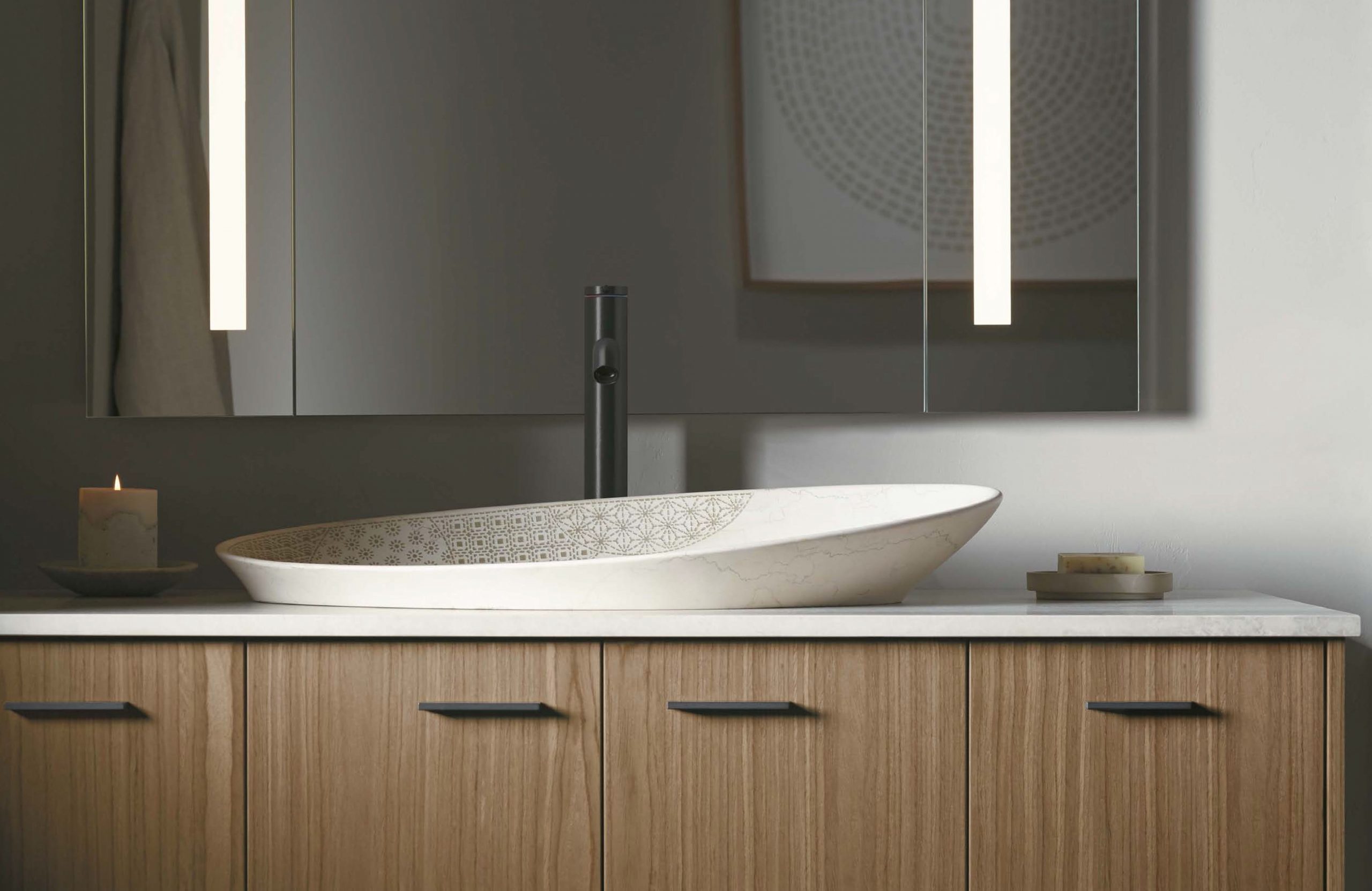
Modern monochromatic bathroom design with light brown flat faced cabinetry, cream sink and granite finishes.
Monochromatic Bathroom Color Schemes
Monochromatic designs and color schemes look great in a bathroom too.
This bathroom strikes the perfect balance between exciting and serene, modern yet still very traditional. Thanks to the unique pistachio cabinetry and matching accessories which includes a custom printed sink and wall art. The dark granite gray hardware and faucet are fantastic choices.
This is one monochromatic design that’s neutral and quite versatile. You may be thinking of how you can work some of the design we’re showing you into your own home, and some will be easier than others. This one is among the easiest. It would be a struggle to find a home where this bathroom designed wouldn’t look fantastic.

Dark Gray Monochromatic Bathroom
This monochromatic bathroom design is built around a dark gray main color which is featured on the walls and matching floor tiles. It’s a striking look that’s even more impressive when seen in person.
By varying the sheen on the floors and walls it helps distinguish the two elements even though the colors are exactly the same.
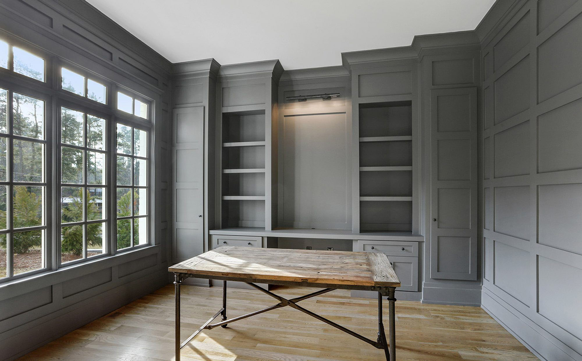
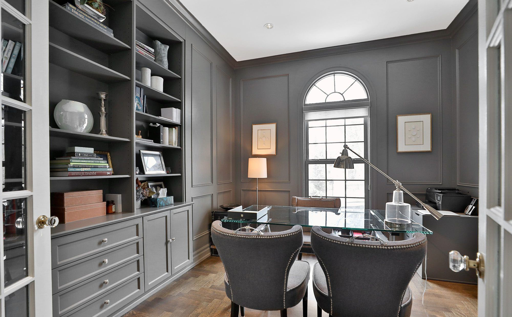
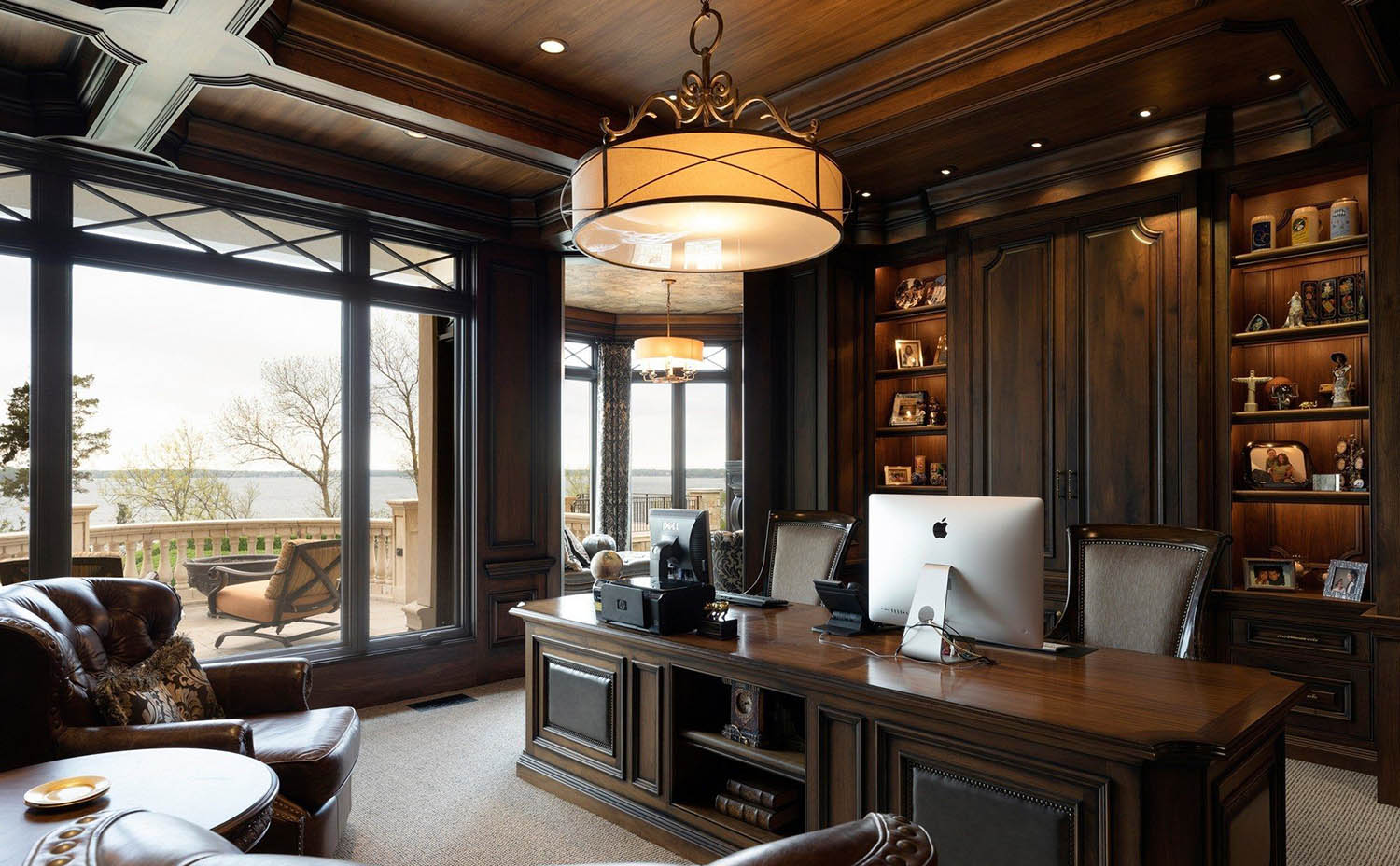
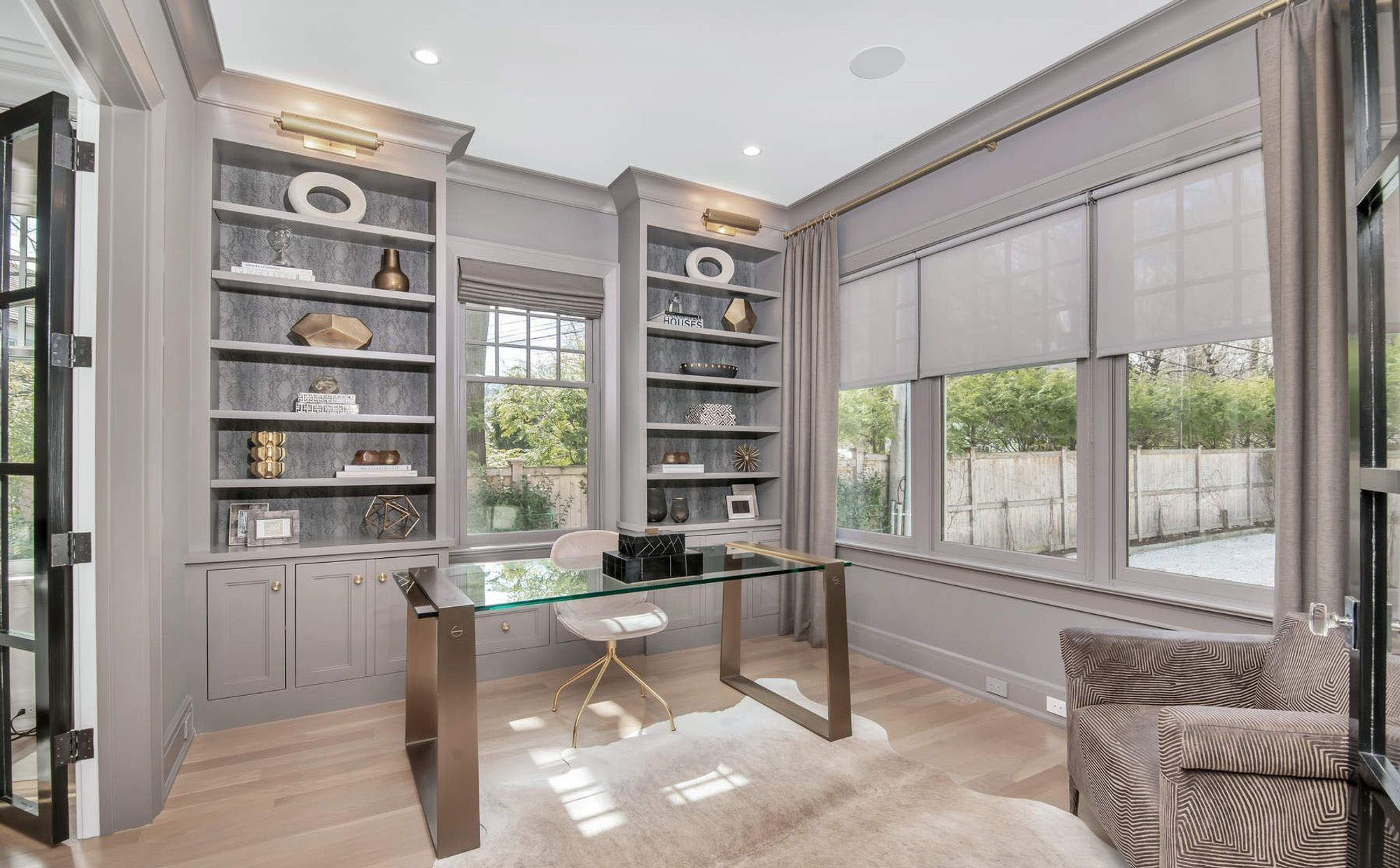
Gray monochromatic office color scheme with built ins and wall paneling. Matching wood desk and hardwood flooring.
Monochromatic Office Color Scheme
A monochromatic color scheme is a fantastic choice for a home office. Since many office include built ins or wall paneling it makes it much easier to design and a lot less busy. You won’t have to choose a color for the walls, another for the cabinets and a third for the trim. All the walls here, from the base trim all the way up to the crown molding are a single color.
Gray looks fantastic with natural materials like real wood which is another reason a monochromatic design looks good in an office. It’s easy to add wood elements to the office like this light wood flooring and rustic desk.
An all gray color scheme like this is also quite relaxing which can be helpful in an office. Whether you have clients in the office or not it still helps to have a soothing place to work in.
- Monochromatic color schemes can be relaxing which has it’s benefits in a home office.
- Gray looks fantastic with real wood.
- Offices are generally kept fairly simple so the design is easy to pull off.
Luckily, if you want a gray color scheme like this your room will be in style. Gray is one of the hottest interior colors at the moment along with other neutrals and it doesn’t look like that’s changing any time soon.
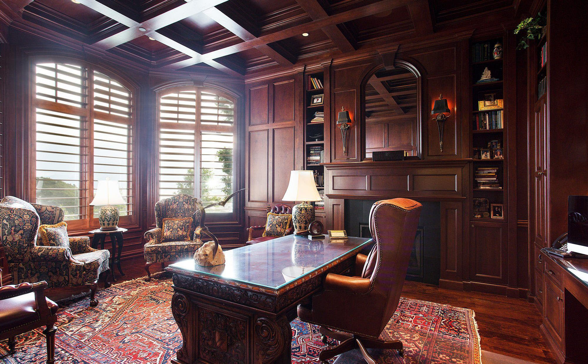
All Wood Office
A monochromatic design is a bold way to make a statement in your home office. Though we’re used to thinking about color in terms of paint, the same principles apply when your using stain.
The very best monochrome styles use texture and materials to their advantage. Since the colors all match so closely other things like wood grain can create the interest you need. If a room like this was all painted the same color it could seem a bit too much, but when your using stain it feels fresh. Even though all the stain color matches, since each piece of wood has a unique grain the room’s monochromatic color scheme doesn’t get monotonous.
This stunning office has everything we love about a monochromatic room which even includes the ceiling. As you’ll notice in most of the monochromatic designs we’ve shown, the color ends at the ceiling. But with a wood room you can expand that color to include the coffered ceiling.
Monochromatic Wood Paneled Office
Here is another fantastic example of a monochromatic office design featuring wood walls.
If you like the design then you really only have two choices to make. Your type of wood and the color of your stain. Keep in mind that stain colors vary from wood to wood. In other words, a stain you like will look different on pine than it will on oak. Make sure you test your stain out on a variety of wood species because what matters is how it all looks in the end.
This brown stain has some red in it and so does the wood. Cherry woods look great with stain because they bring out these deep, rich colors. Be prepared to spend though because this monochromatic look is expensive. Stain grade woods cost a lot to both buy and build with.
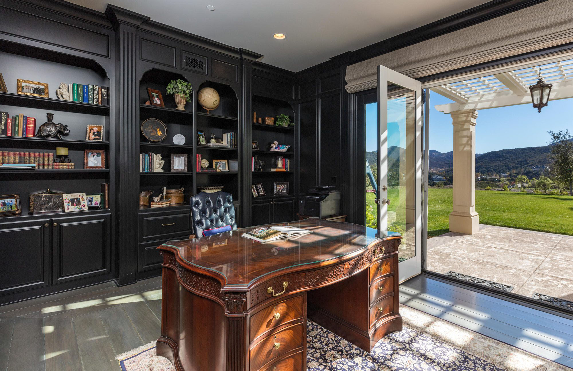
An All Black Office
Contrary to what you may have been told, painting your walls black won’t necessarily make the room feel dark and gloomy.
In this home office, mainly due to the indoor outdoor design and natural light, the room is very bright. The black walls create a beautiful contrast with the much lighter outdoors. Gray is a great color to use as a flooring because it’s related to the black and a neutral so it works with all your other color choices. This is also true of the real wood desk. It’s a great choice that keeps the room from feeling too cold.
Cool Light Gray Monochromatic Office
If you want a monochromatic office but don’t like any of those dark designs then go with something much lighter.
This home office features floor to ceiling light gray walls and built in cabinetry. Most monochromatic room design include matching walls that extend from the base trim all the way up to the crown molding. And the walls are all the same no matter the material. Drywall and wood wall paneling or built ins should all be painted the exact same color.
The secondary and accent colors are all branches of the same light gray only with some warm tints which creates a nice cream color.
A mix of dark and light woods completes the look. Notice how the wood stains were kept neutral, flat and a bit grayish. They’re a different color but still fit the room’s design.
Warm Gray Monochromatic Office
Warm light gray works great in a home office too. But what we really love about this room are all the metallic finishes. These bronze gold finishes are on the warm side and look fantastic with this particular shade of gray.

Lavender Home Office
There’s no rule that says only a wood monochromatic color scheme can have a matching ceiling. This room features lavender blue walls, trim and built ins with a matching coffered ceiling. If you like a single color room design then there’s not many more ways to push it further than this.
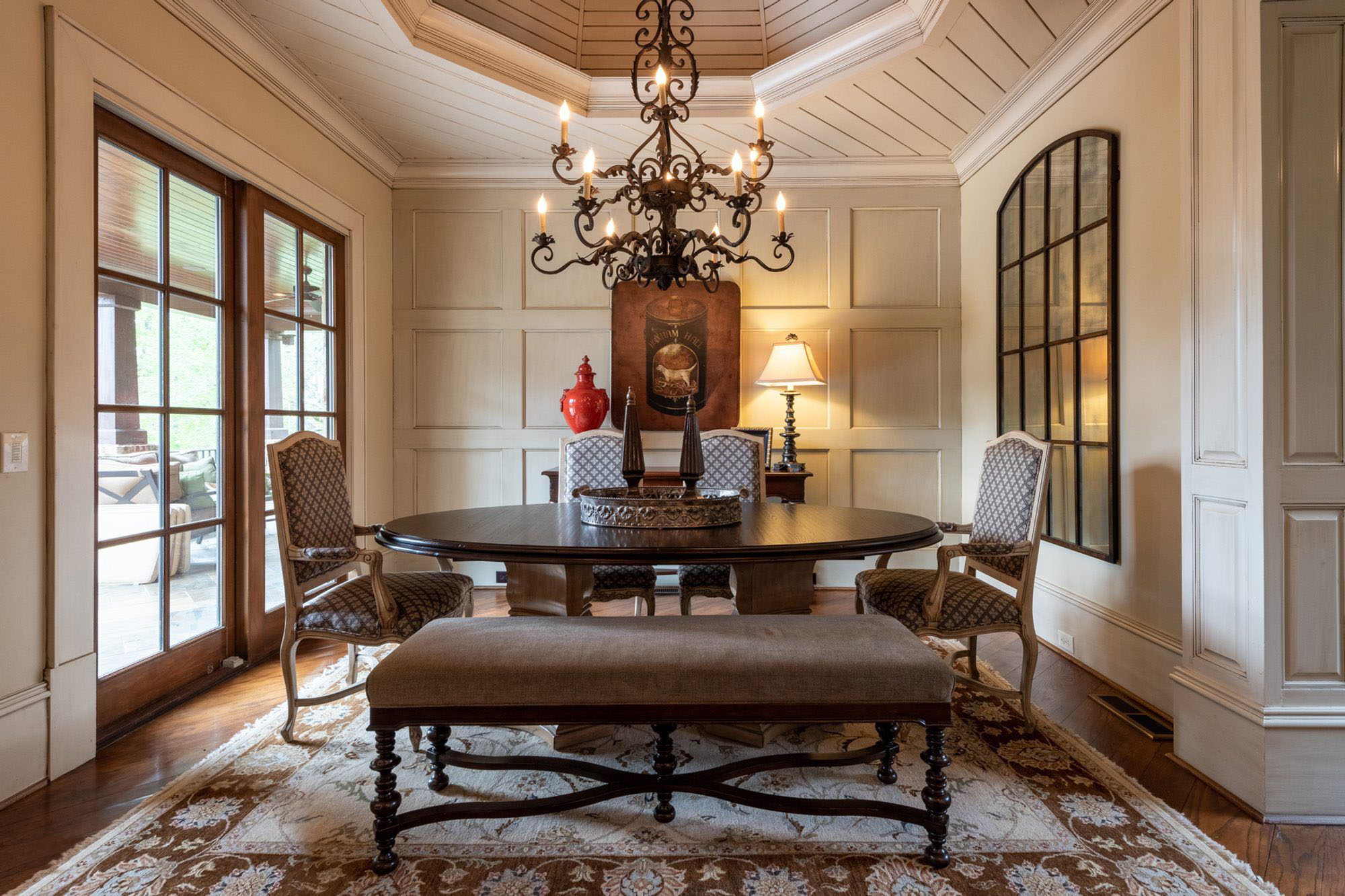
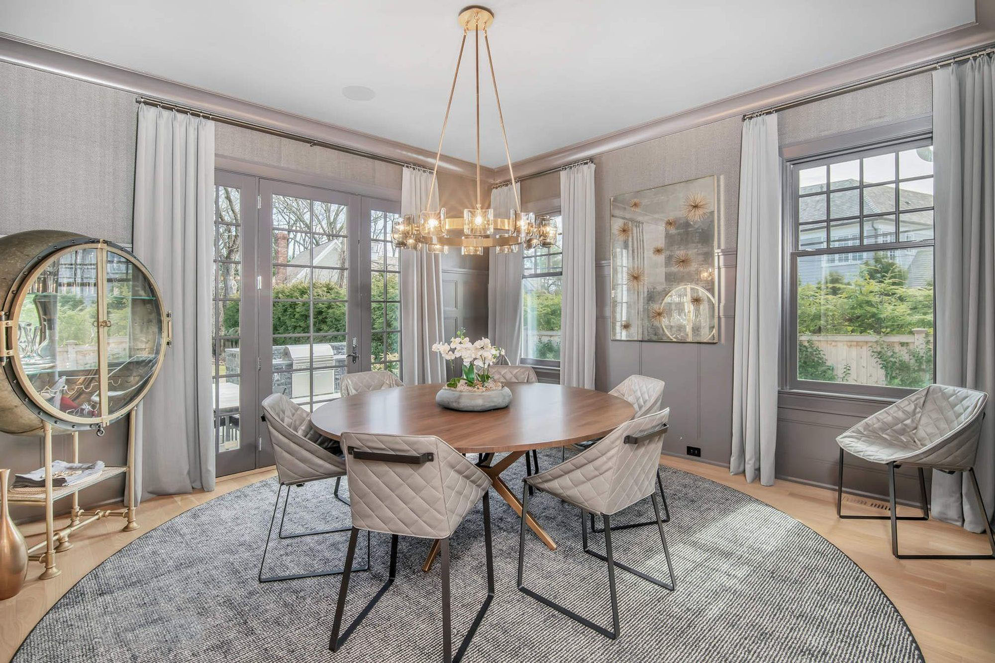
Beautiful dining room with floor to ceiling warm cream paint including this custom ceiling design.
Monochromatic Dining Room Color Schemes
Monochromatic dining room ideas and designs are some of my all time favorites. Which include the beautiful example shown in the photo above. That is one beautiful dining room featuring a real wood table and chairs, wall paneling, wood floors, area rug, and a custom built raised ceiling. And because the room has a warm cream monochromatic color scheme it’s rich and sophisticated in a way few other designs can match.
Rustic design is as much about the atmosphere than the actual colors. Sure, the colors all have to be related, but what you put in the room is important too.
Just filling a room with random stuff that’s the right color isn’t enough to make a dining room like this so pay careful attention to every selection not only in terms of color and value but also style.

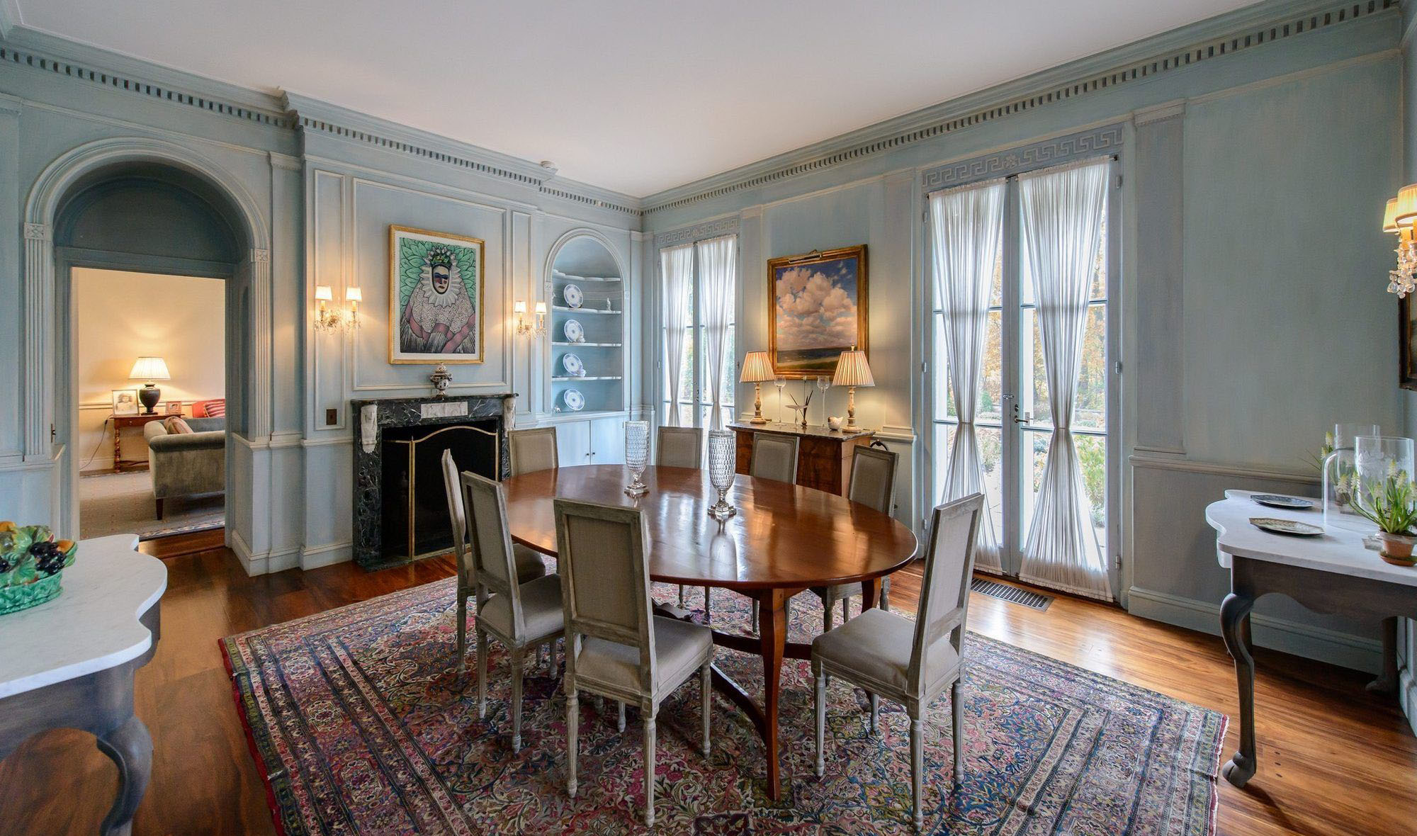
Moody Blues
Go bold and dramatic with deep shades of blue. The shade helps establish a serene, relaxed feeling. Use a contrasting tone if what your going for is a striking look. That’s exactly what the designers did here. They’ve used gold in both the artwork and dining chairs.
Notice how they’ve used varying textures and finishes throughout the room. The plush gold chairs, gold metal and metallic gold paints are all the exact same color, but have a very different effect because of the material.
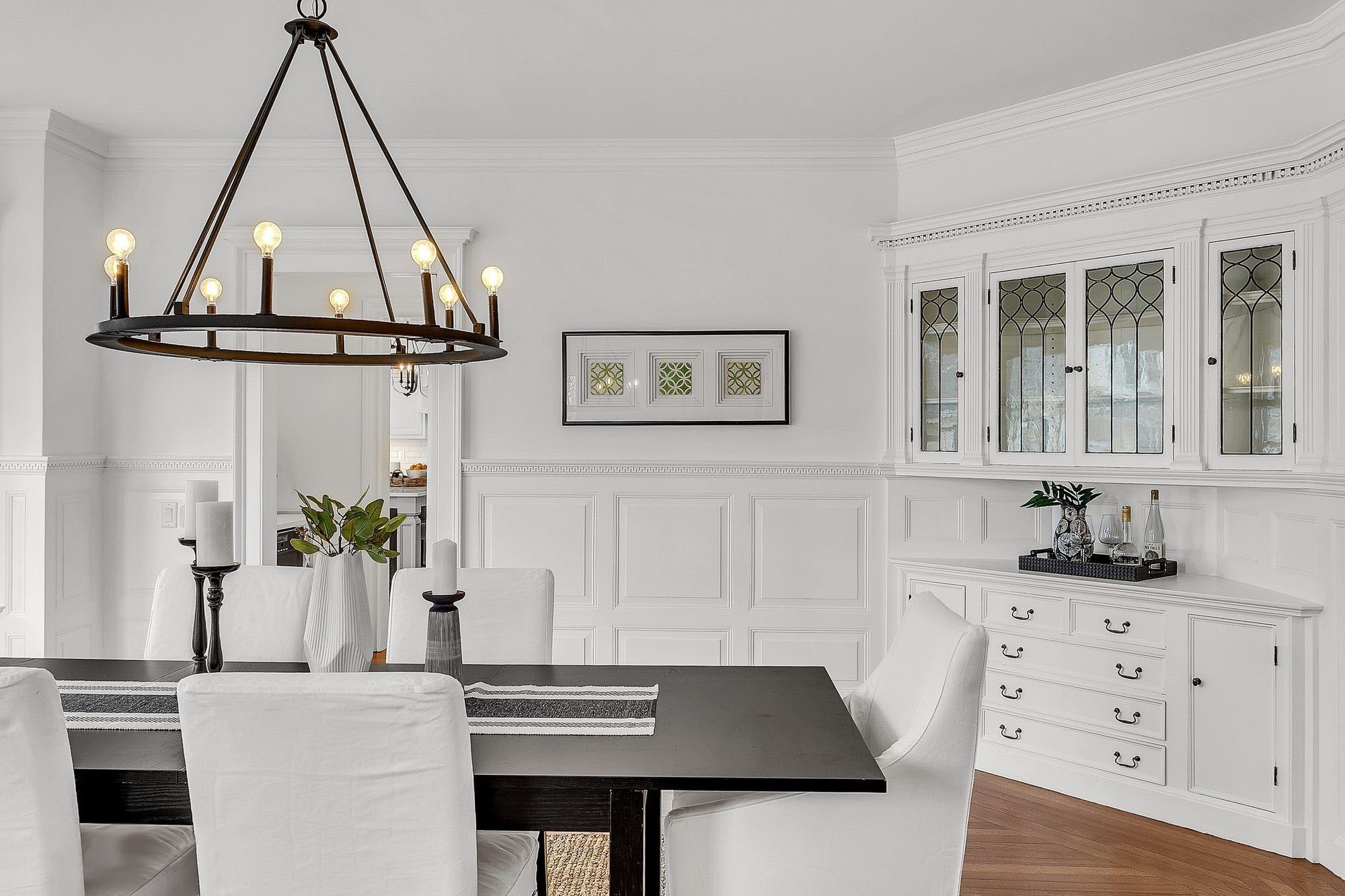
All White Dining Room
This gorgeous, light and bright dining room proves monochrome design can still be subtle. By adding in a dark wood table and other black accents like the candles, frame and cabinet hardware throughout the room, the space feels tied together. This white and black design is very popular at the moment. It slants modern but not too modern so most homeowners seem to really like it.
If you want more of a low key monochromatic look, then this design may be for you.
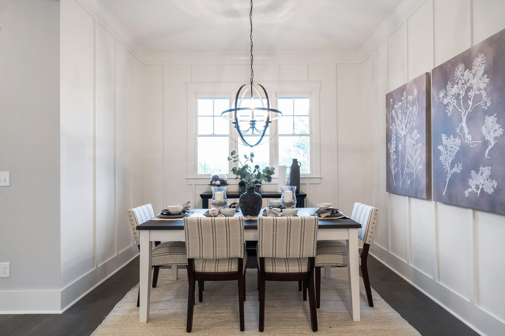
Another Monochromatic White Dining Room
Here we see another white monochromatic dining room color scheme that’s using a super dark wood stain called coffee bean or espresso. It’s just a shade lighter than pure black which is nice because you can still see wood grain up close. But it’s dark enough to still give that black and white effect people want so much.
Warm Grays With Metallic Finishes
This room is more of a sitting room than formal dining area and includes a round table large enough to seat size. The walls are all gray from floor to ceiling with wood wall paneling and matching wall paper. The use of wall paper is nice because you get the same color but a little more texture which helps break the walls into sections.
The designers have also varied the sheen a little which helps the crown molding stand out. The color is the same as the walls trim but since it’s shinier it actually appears a bit more purple.
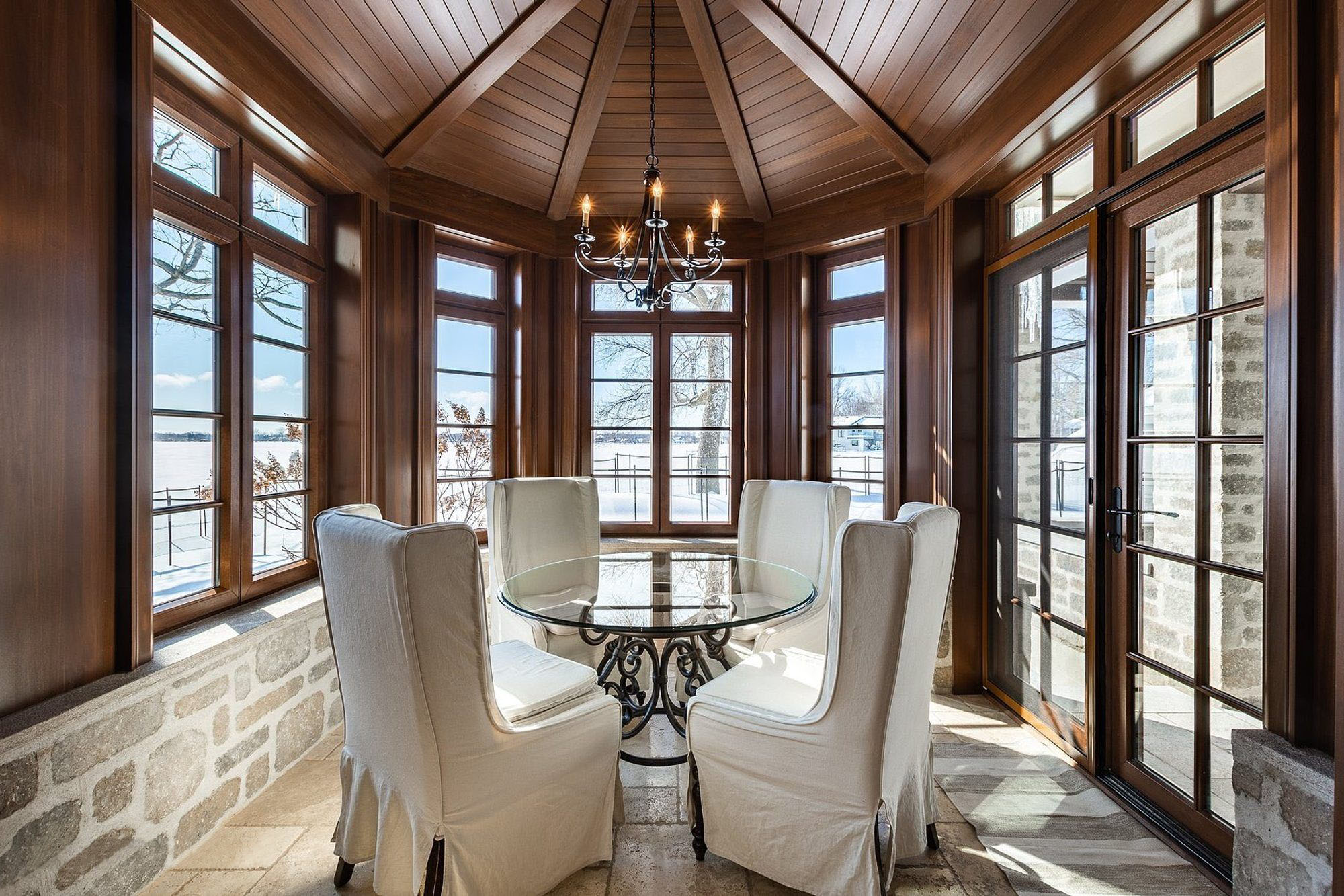
Small Monochromatic Dining Room
This is more of a sunroom that a dining room but we thought this was the right place for the picture. The wood walls and matching coffered ceiling are a monochromatic design that flows beautifully with the stone walls and tile floors.
What I really like about this design is how the wood stain and furniture flows so nicely with the stone. Natural materials can be harder to work into a monochromatic color scheme because you can’t change their color. You just have to find materials that’ll work for the look your going for.
Beautiful Monochromatic Gray Dining Room
This monochromatic dining room is among my all time favorites. The design is based around a gray main color which branches off into a variety of secondary and accent colors.
The designers have also included lots of textures and materials which keeps the room looking fresh. Notice how they’ve used light and dark shades along with bright whites and black. The entire value range is represented here as well as a range of textures. Flat, smooth walls and chairs, with rough stone floors and beautifully textured real wood. I even love the small details like the stripe of real wood in the chair rail trim and metal accents in the dark gray bench seat.
This room is spectacular and does everything about a monochromatic color scheme just right.
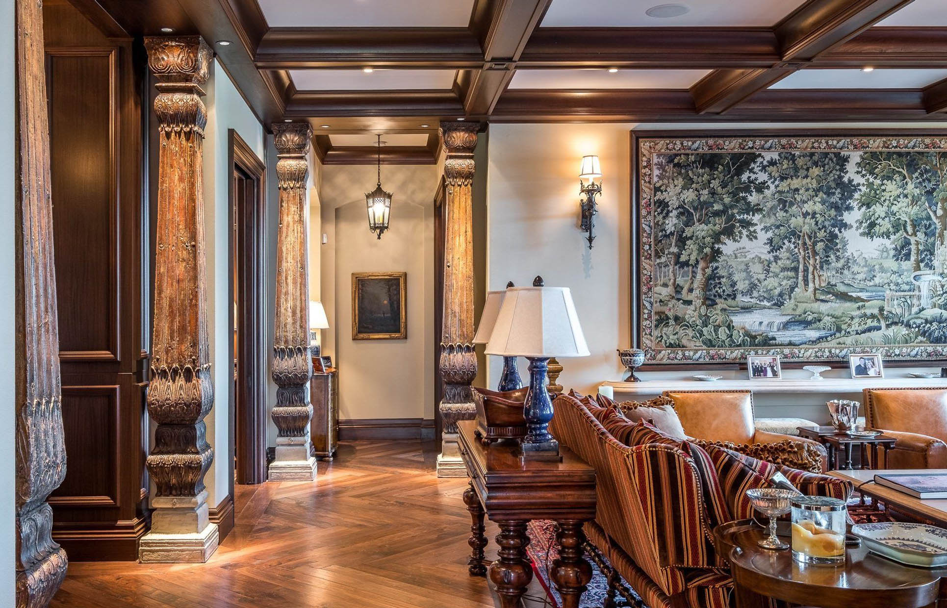
Bohemian monochromatic design featuring wood floors and furniture with stone walls and wood columns. Brown is obviously the main color here.
Monochromatic Color Schemes
Monochromatic color schemes can be used in just about every room of the house.
Some of the best looking color combinations revolve around a single color. It gives you a chance to be creative with color and try things you wouldn’t ordinarily consider as an option. Lots of materials and combinations work with this type of design that aren’t really an option with a more traditional style. Monochromatic color schemes are more deliberate and well planning. You don’t accidentally create an entire room based on a single color by accident. Everything that goes into these rooms is carefully considered and included on purpose.
Because of this attention to detail the rooms are more refined. They tend to be cleaner and have more of a modern feel, if if the style isn’t modern at all.
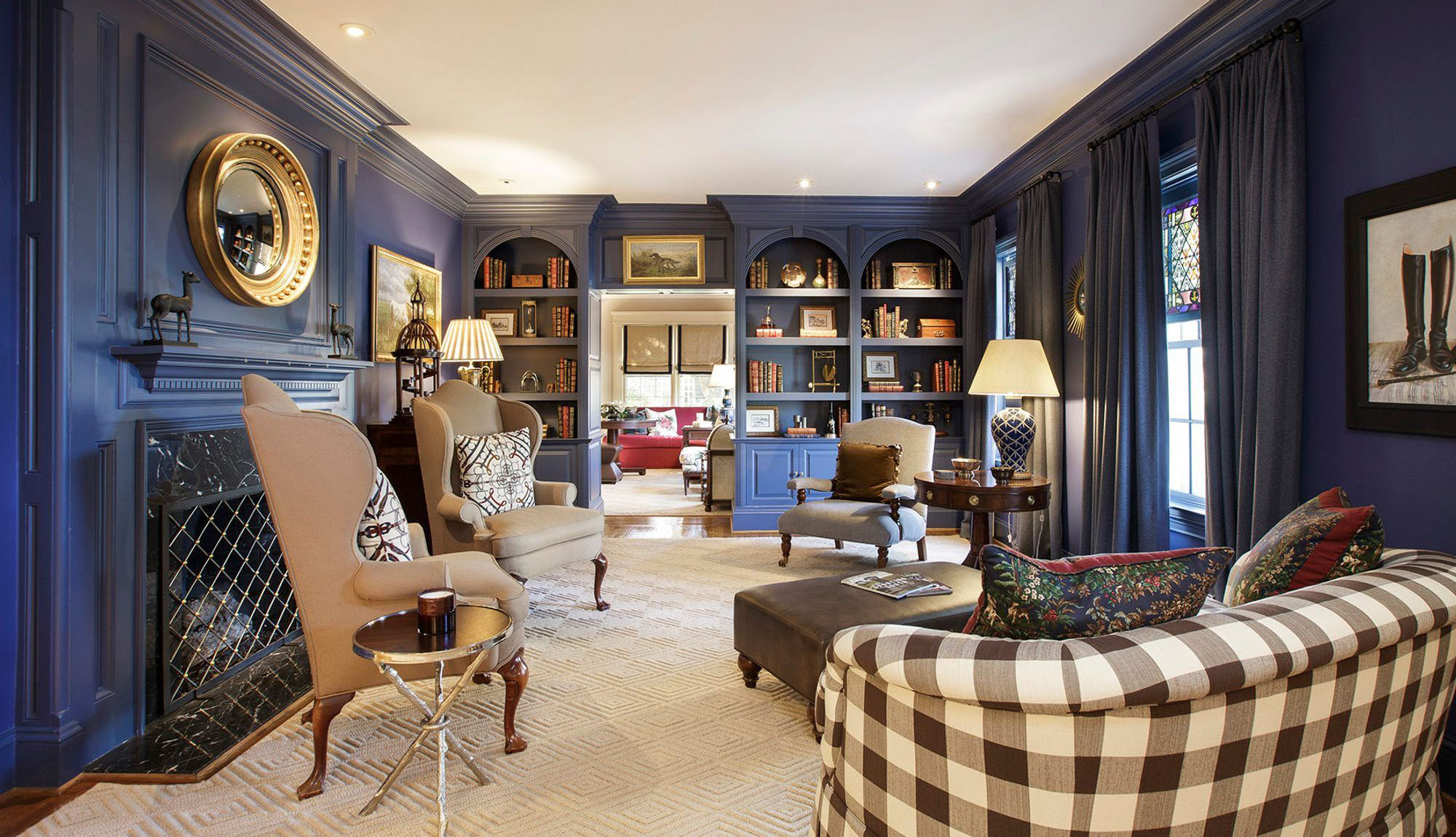
Monochromatic blue sitting room with built ins and blue fireplace surround. Brown secondary colors with a variety of materials and textures.
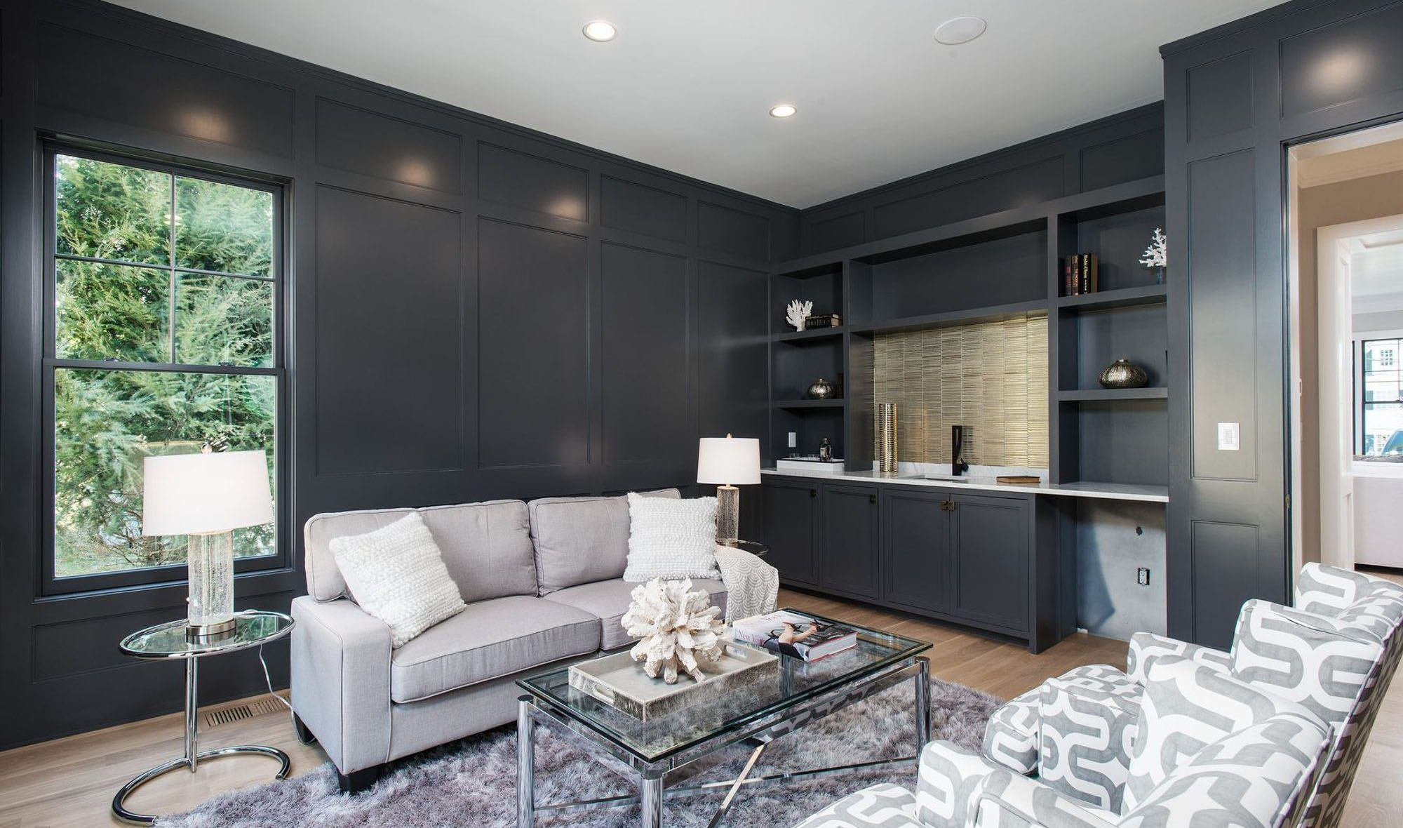
Gray sitting room with wall paneling and built ins which include a wet bar.
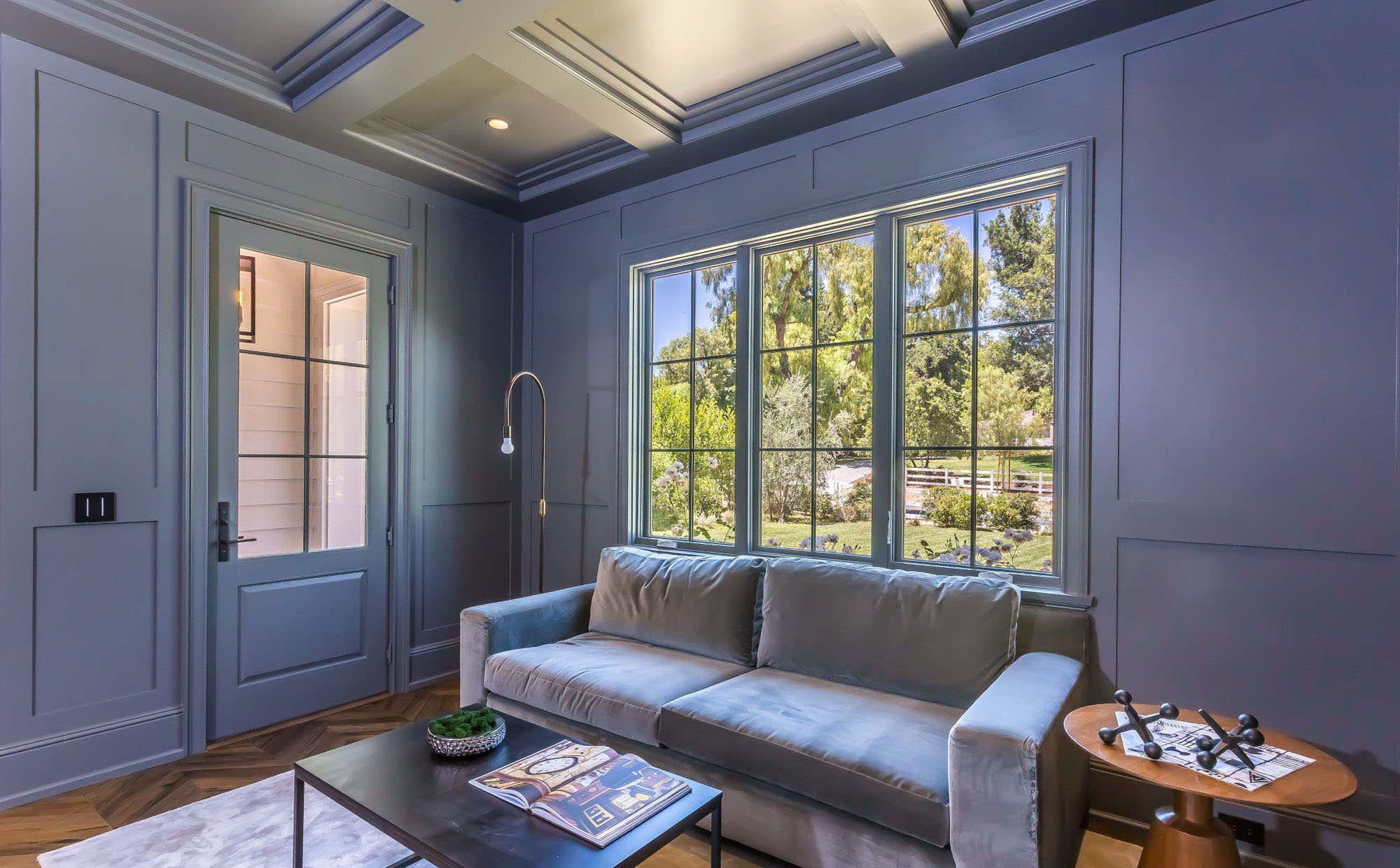
Blue monochromatic sitting room with matching blue coffered ceiling.
Teal living room with matching teal fireplace surround. Gold metallic finishes.
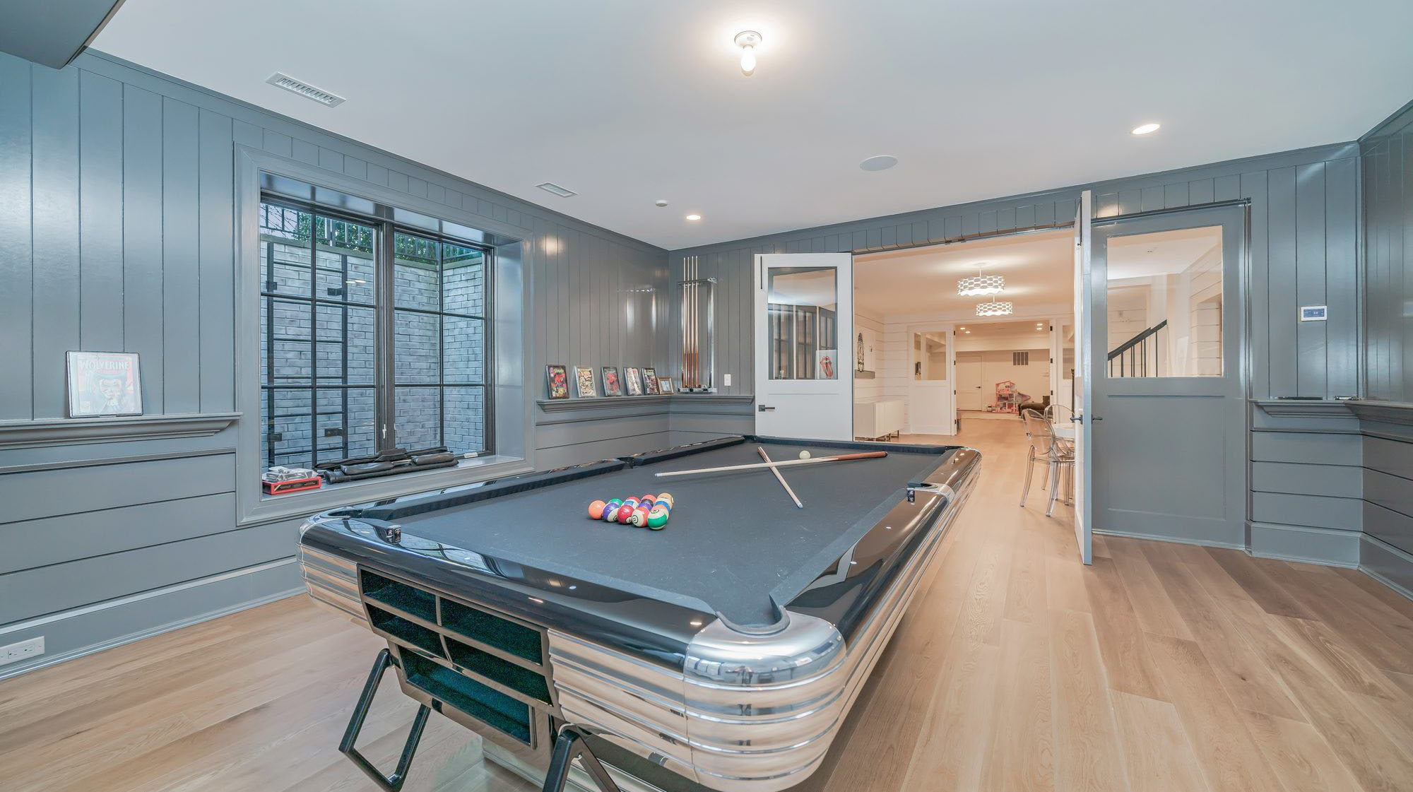
Blue gray game room with matching pool table felt.
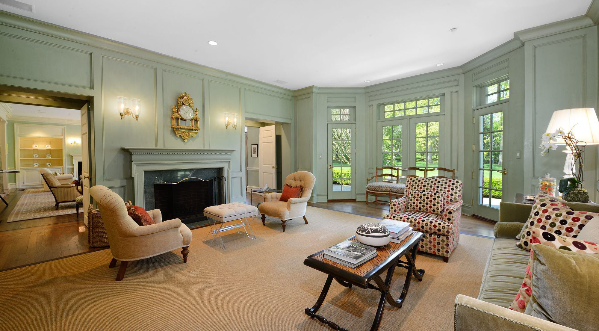
Light blue monochromatic living room design with an antique Victorian style.
Summary: Monochromatic Color Schemes
Have you ever see a room designed around a single color and wondered what the design was called? It’s called a monochromatic color scheme.
A monochromatic color scheme, or a room designed around a single color, doesn’t actually have to be one color. They can actually be quite colorful including lot of materials and textures if you design them right. The colors only need to be related but not all exactly the same. Monochromatic color schemes can give a room a modern, sophisticated look with lots of energy and sophistication. Focusing on a single main color with a range of related shades and tints helps a space feel cohesive. Especially when the design extends beyond just paint colors and into other things like furnishings and décor.
In this article we’ve discussed how to design a great monochromatic room with lots of example pictures, tip, tricks and advice from the builder and I hope a bit of this helps you design something beautiful.
If you have any questions or comments e-mail us any time. We’d love to hear from you.